Creating a habit-forming breast checking app to help beat breast cancer
Breast Cancer Now’s mission is to eliminate breast cancer as a fatal disease by 2050. A key part of achieving this is empowering women to spot signs and symptoms of breast cancer early, and giving them the advice and support they need through a brand new app, Breast Check Now.
Breast Cancer Now aims to eliminate breast cancer as a life-threatening disease by 2050. A major part of that mission is helping women detect signs and symptoms early — which can lead to faster treatment and save lives.
However, research revealed that 44% of UK women don’t check their breasts regularly, and 10% have never checked at all. Even though two-thirds of breast cancers are detected by women noticing changes themselves, many lacked the confidence, knowledge, or habits needed to check consistently.
The app also needed to reflect Breast Cancer Now’s newly merged brand identity, and sit seamlessly alongside their broader portfolio of digital tools.
Behavioural and design challenges:
- Low confidence and knowledge around self-checking
- Lack of habit formation and forgetfulness
- Sensitive medical content requiring an empathetic tone
- Mixed levels of digital literacy across a wide demographic
Project objectives:
- Encourage and support regular breast checking
- Deliver content and reminders with empathy and clarity
- Ensure the app is inclusive and intuitive across age groups
- Align with Breast Cancer Now’s new visual and brand standards
We approached this challenge by deeply embedding user insights into every stage of the design process. From research and behavioural mapping to iterative prototyping and testing, the app was designed to build trust, confidence, and consistency — one small habit at a time.
As lead UX designer for both the app and Breast Cancer Now’s new website, I embedded early research around app usage into broader usability testing for the site. We introduced future-facing questions around a personalised checking experience to gauge appetite and expectations without biasing responses.
We also drew from:
- Commissioned behavioural research
- Audience segmentation data
- Interviews and surveys with women across age groups and backgrounds
This research highlighted key motivators and barriers:
- Motivators: Peace of mind, reminders, easy guidance
- Barriers: Forgetfulness, low confidence, unclear instructions, unfamiliarity with symptom
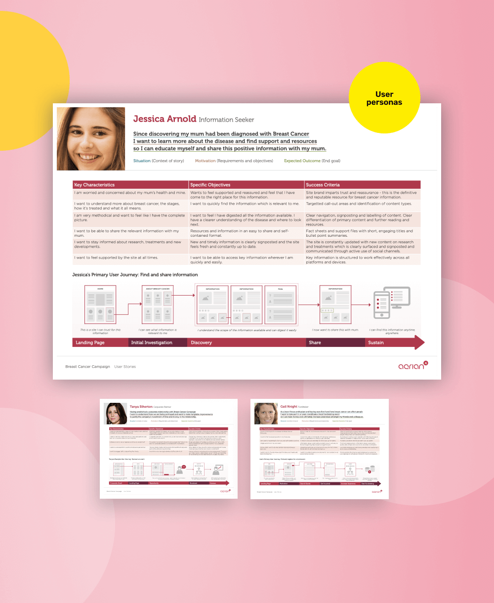
Using this insight, I created a detailed set of personas that reflected different audience segments — from digital natives to older, less tech-savvy users. These personas shaped design decisions by focusing on real emotional and practical needs.
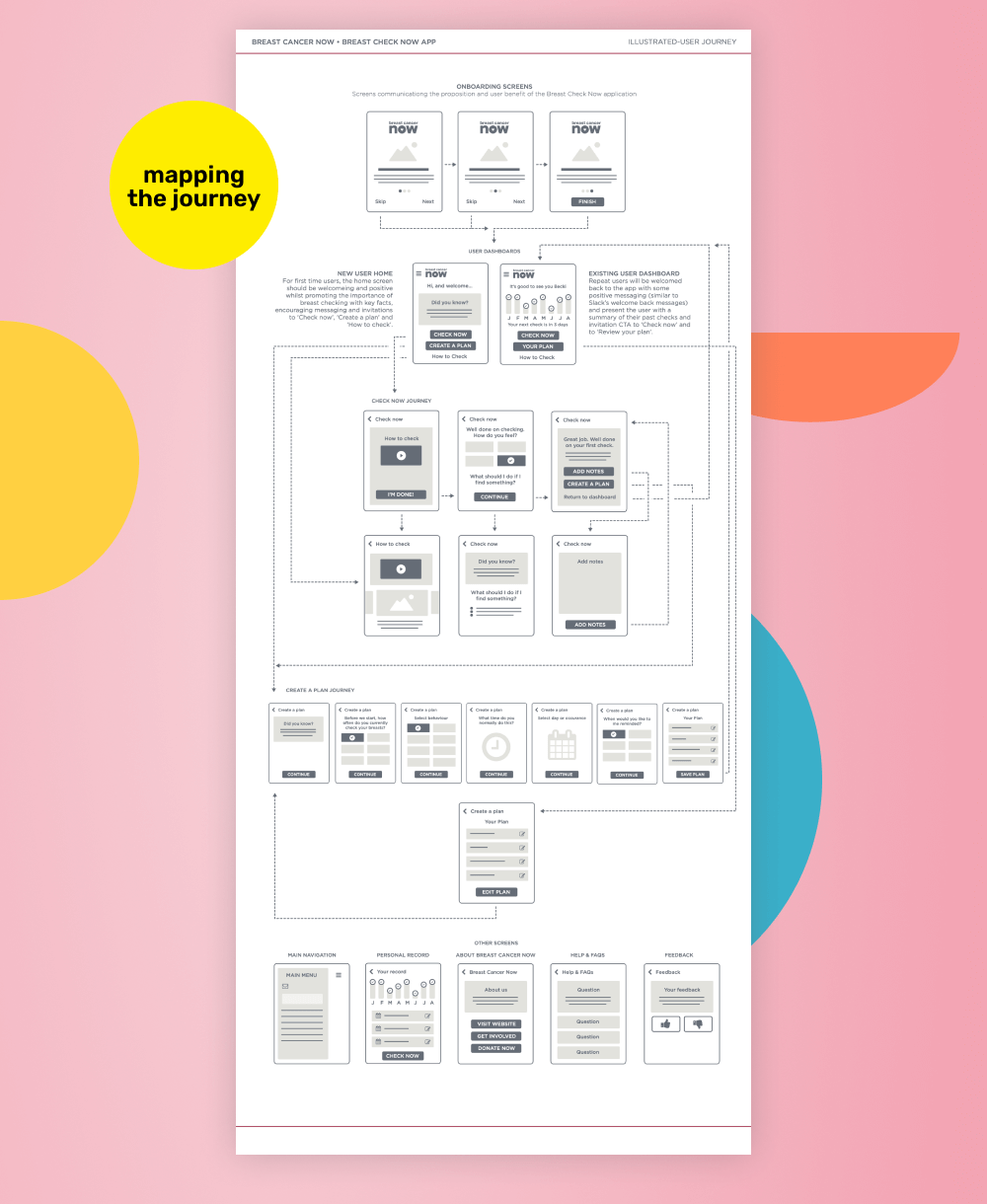
I also mapped key user journeys to understand when and how users were likely to engage:
- How onboarding could establish a safe, supportive tone
- When users might want reminders (e.g. monthly, tied to routine events)
- What role supportive content should play in easing anxiety and guiding behaviour
These journey maps were co-developed and iterated with the medical, content, and delivery teams — ensuring the app’s functionality aligned with health messaging, technical constraints, and clinical accuracy.
We prototyped early wireframes around key flows:
- Onboarding and permissions
- The checking guide and diary
- Setting reminders
- Receiving encouragement and medical content
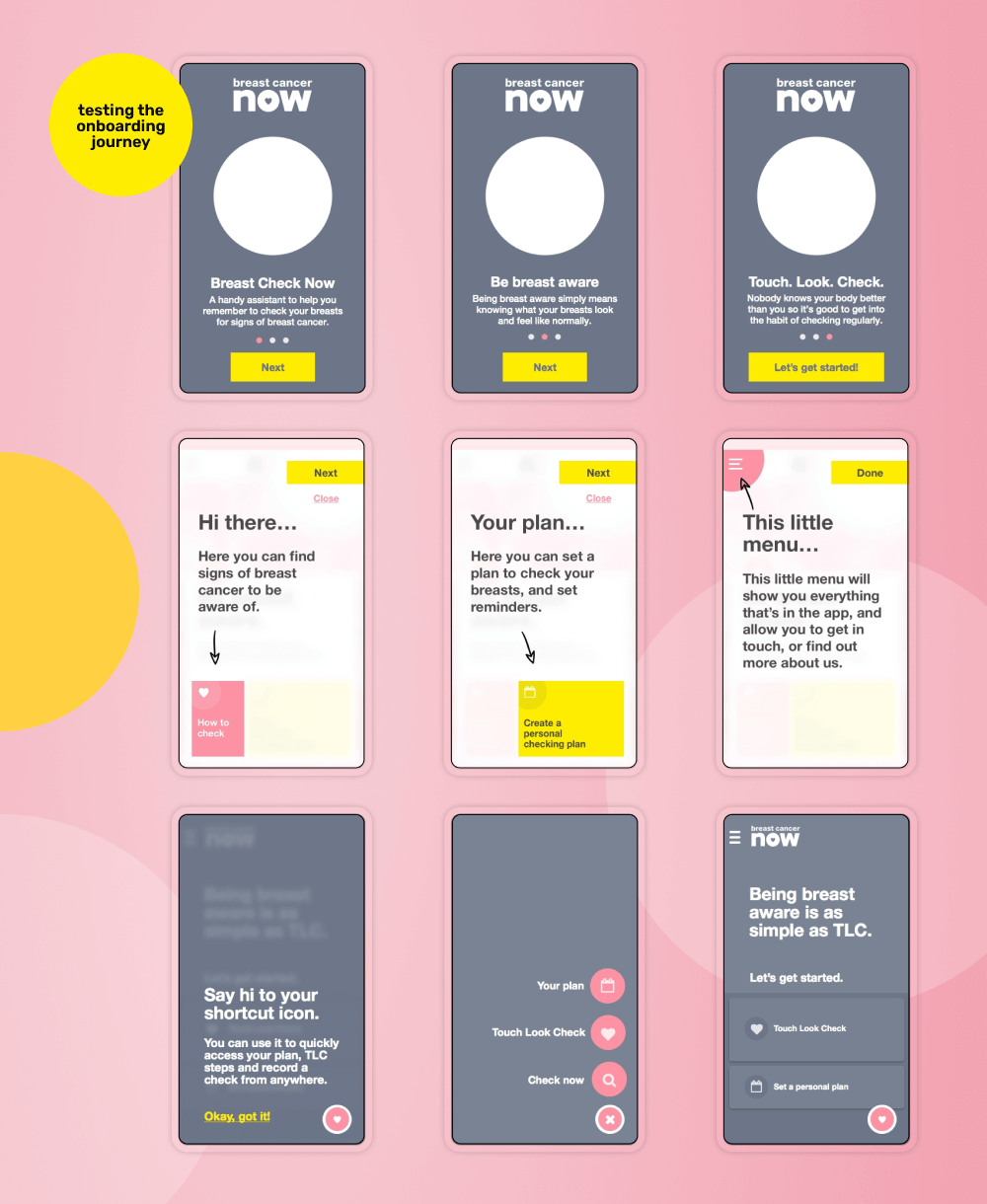
We tested these prototypes across a broad age range and iterated heavily based on feedback — particularly around usability and navigation.
Our early prototypes included modern UI patterns like a floating action button — but user testing revealed that this wasn’t intuitive for many older users or those unfamiliar with app conventions.
We pivoted to a fixed bottom navigation bar, prioritising familiarity and clarity over trendy aesthetics. This decision required technical rework but significantly improved discoverability and user confidence — especially in a health context where clarity is essential.
This was a critical learning moment: good design meets users where they are — especially when health outcomes are at stake.
To ensure brand consistency, I leveraged and extended the visual language of the newly relaunched website. The app used:
- Established colour, typography, and layout foundations
- Accessible interaction patterns (WCAG 2.2 AA compliant)
- Consistent tone of voice across content and UI
This allowed the app to launch quickly while remaining recognisably part of the wider Breast Cancer Now brand.
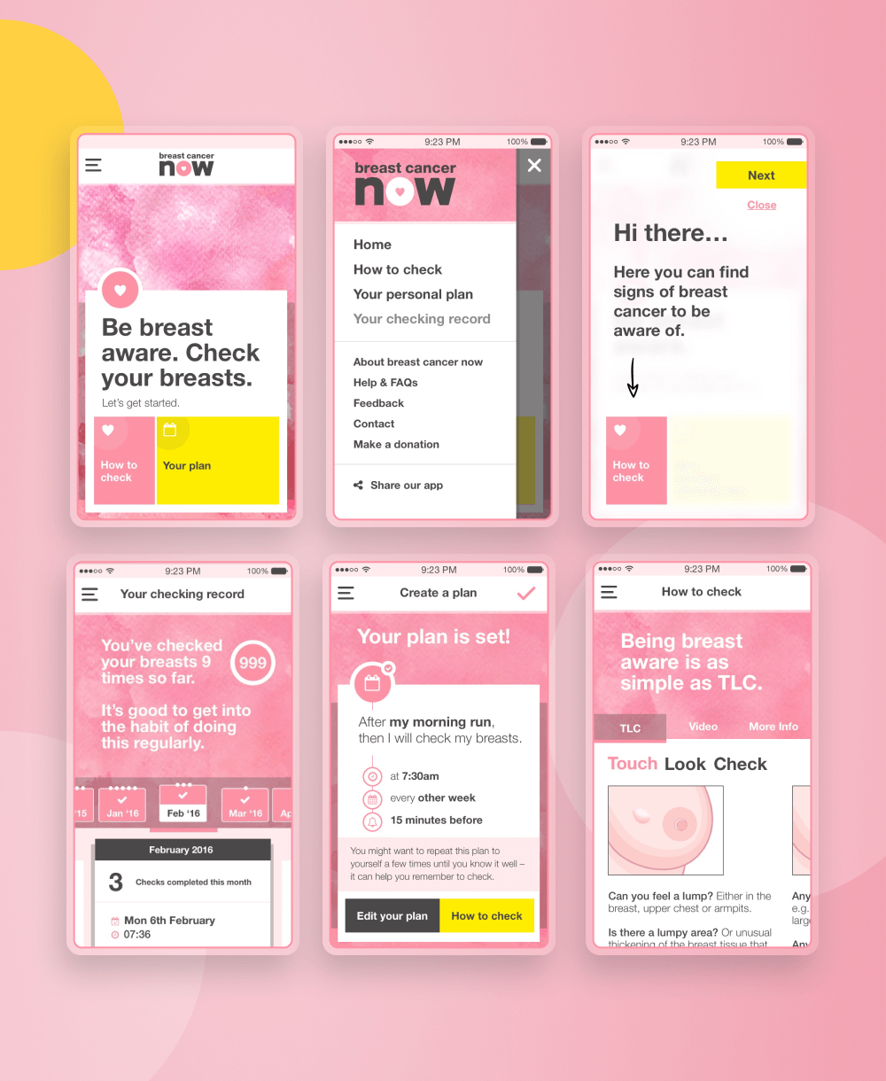
The result was a warm, accessible, and empowering experience that guided women through regular breast checks without overwhelming them.
Key features included:
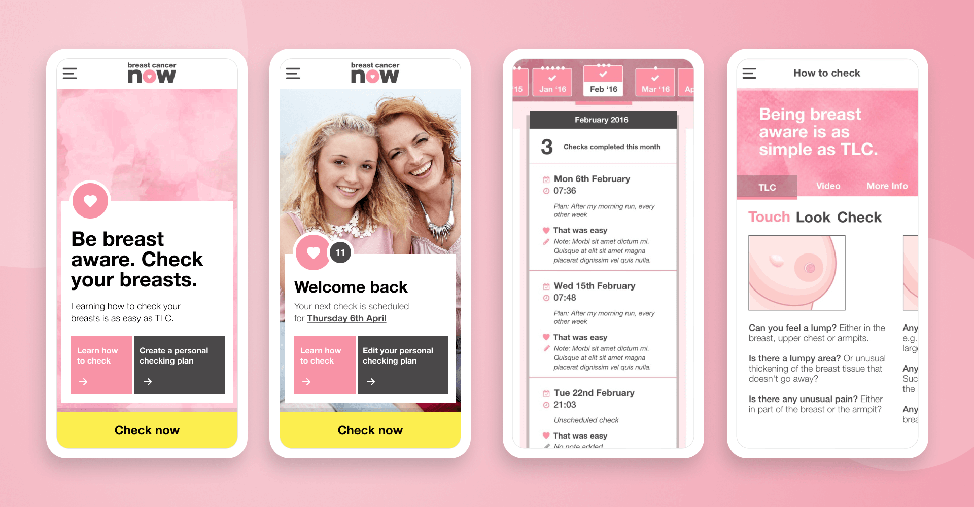
- A friendly, easy-to-follow check guide with illustrations
- Customisable reminders to help form healthy habits
- A personal diary to log checks and spot changes
- Supportive content tailored to each user’s journey
By combining empathetic UX with behavioural insight, we created an app that truly supported women — not just in knowing what to do, but in feeling confident doing it.
The app is now a vital tool in Breast Cancer Now’s mission — one that not only raised awareness but changed real-world behaviours around self-checking.
This was one of the most meaningful and impactful projects I’ve worked on.
Rooted in empathy and driven by real user behaviour, Breast Check Now turned good intentions into lasting habits — helping thousands of women feel more confident in looking after their health.
It also showed how UX can truly save lives when done with care, insight, and collaboration.
Familiar patterns beat flashy ones — especially in healthcare
Inclusive testing is essential to uncover blind spots
Micro-interactions matter — small nudges, reminders, and affirmations helped reinforce habits and build confidence
Involve a more diverse set of testers earlier — including non-native English speakers and neurodivergent users
Explore more sophisticated personalisation — including custom check schedules or symptom tracking for different life stages
Build in analytics from day one to measure behaviour change and content engagemen
